

A Symphony of Color and Shape
Visualizing the complexity of science without the cacophony
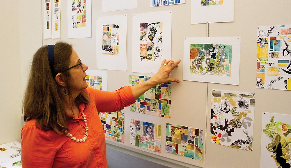
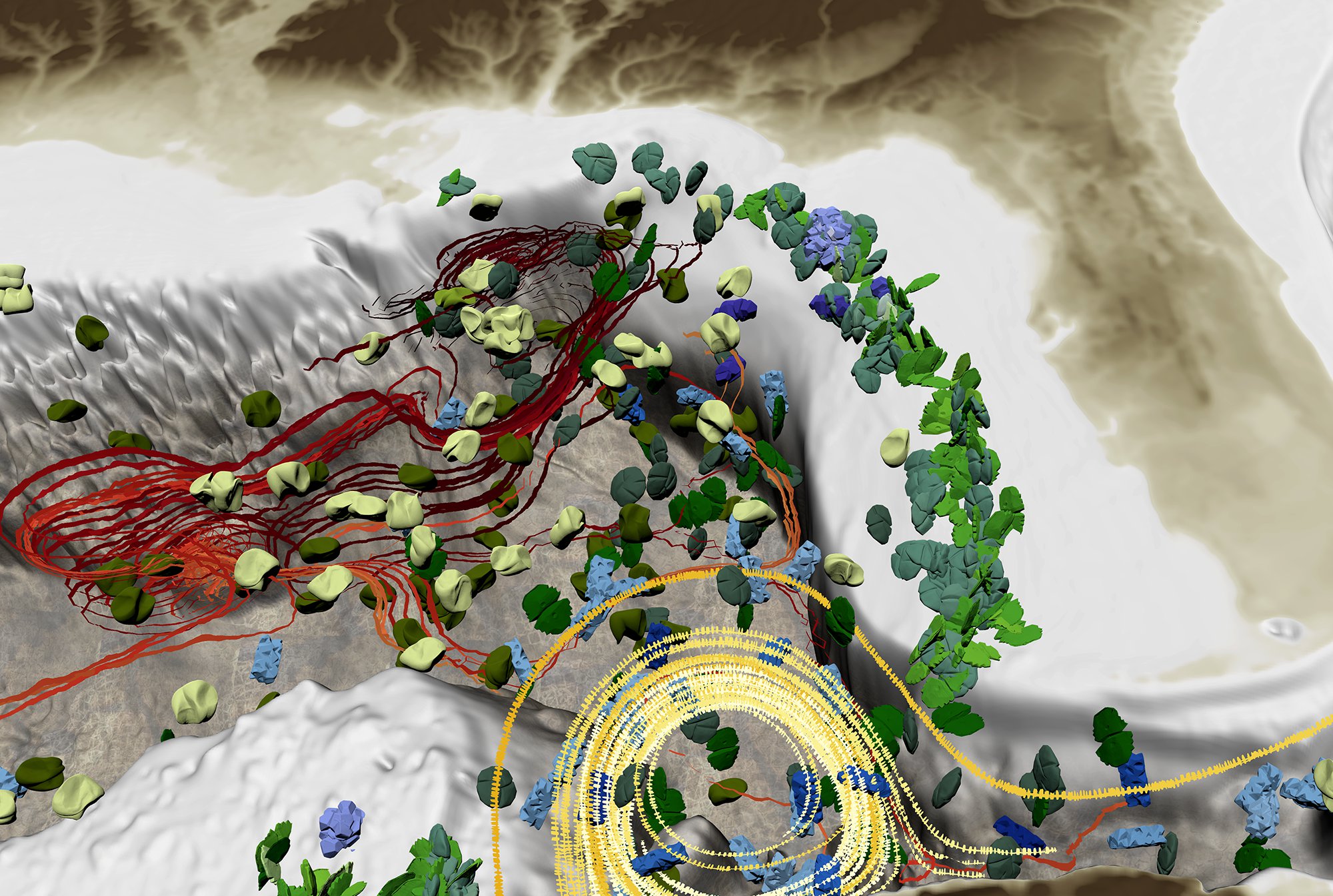
Francesca Samsel’s office looks different than those of her colleagues at TACC. Her whiteboard is full of colorful collages rather than formulas and algorithms. Her shelves hold pastels, paint, and books on color theory, rather than volumes on programming languages. Her computer, however, displays the latest scientific visualization she’s been working on — a complex, colorful rendering of currents in the Gulf of Mexico.
For decades, scientists have brought the data generated by their research to visualization experts, who have created tools that make it possible to see what that data represents. Simple color palettes and basic shapes are associated with the data, and patterns begin to emerge that can then be analyzed.
"I was breaking the rules, but I didn’t know I was breaking the rules."
This is the field of scientific visualization, and it’s been an invaluable resource in advancing research. Samsel, a research scientist and visualization expert at TACC, brings a lifetime of artistic expression to her work, and sees the potential for pushing the traditional boundaries and limitations of scientific visualization. She considers her role as an artist to be the third leg of the scientific visualization tripod, alongside the scientists doing the research, and the computer scientists and engineers creating the tools to visualize it.
“Our eyes are the fastest way to take in and process information,” Samsel says. “But raw data is not easily parsed. Associating color, shape, and composition with the data makes it much easier to understand.”
Samsel began to recognize how her artistic background could impact scientific visualization in new ways as she watched her husband, Greg Abram, a computer scientist at TACC specializing in visualization, working with his colleagues to create color palettes for their work.
“We live in a world of specialists,” Samsel says. “Greg and his colleagues studied computer engineering and science, and are brilliant at what they do, but we all specialize in something, and there’s a reason for that.”
She uses music as an analogy to explain how adding an artistic specialist can improve scientific visualization. “If the work being done by the scientists and engineers is a single instrument — a drum, perhaps — then the possibilities of what can be done with a greater understanding of color, shape, and composition is like an entire symphony,” Samsel says. “It’s complexity without cacophony.”
The prevailing wisdom in the world of scientific visualization is that you can’t represent more than five elements of the underlying data without creating a cluttered and incomprehensible final product. Using her analogy, it would be like a symphony without a conductor, playing off beat and out of key.
However, Samsel’s lifelong work in the visual arts gave her the perspective that, with proper composition, much more can be represented.
“I was breaking the rules,” Samsel says, “but I didn’t know I was breaking the rules.”
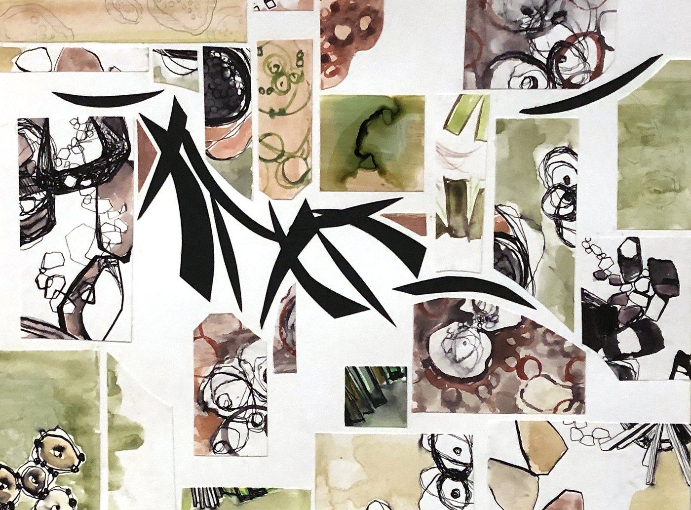
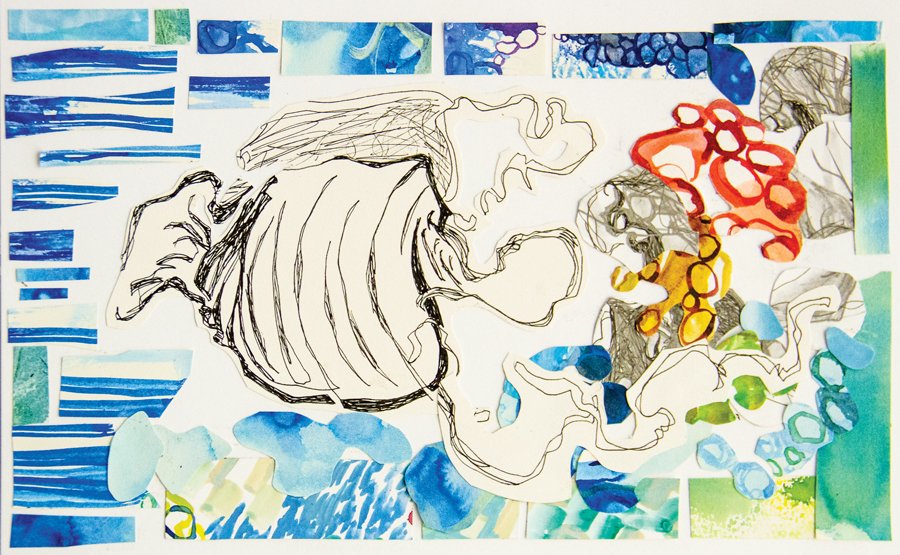
The “rules” didn’t make sense from her artistic perspective. She offered the example of a painting, which is tightly structured, and can convey a lot of meaning. She applied this perspective to the data she received from scientists.
Samsel’s first forays into this working relationship began with color, which is the primary tool used by visualization experts to make associations with data. Color has scalar value, from light to dark, but also has instantly understandable relationships like cool and warm.
"Our eyes are the fastest way to take in and process information, but raw data is not easily parsed. Associating color, shape, and composition with the data makes it much easier to understand."
“Colors interact and create relationships between the objects in the visualization,” Samsel says. “It’s the most complex, but also the most simply absorbed tool we have.”
Shapes, known in the visualization world as glyphs, have similar innate relationships. Abram, who has been a scientific visualization expert for 30 years, says that his wife’s perspective broadened his point of view. “We’ve used glyphs before,” Abram says, “but we’ve used very cold and fixed objects to represent the glyphs.” For example, Abram used triangles to represent currents, and squares or circles to represent molecules.
Samsel noted these limitations, and realized that using different kinds of shapes — beyond simple triangles or rectangles — can allow for more information to be represented on the screen. She questioned why simple shapes could not be replaced or supplemented with more complex ones that carried more visual impact and associations.
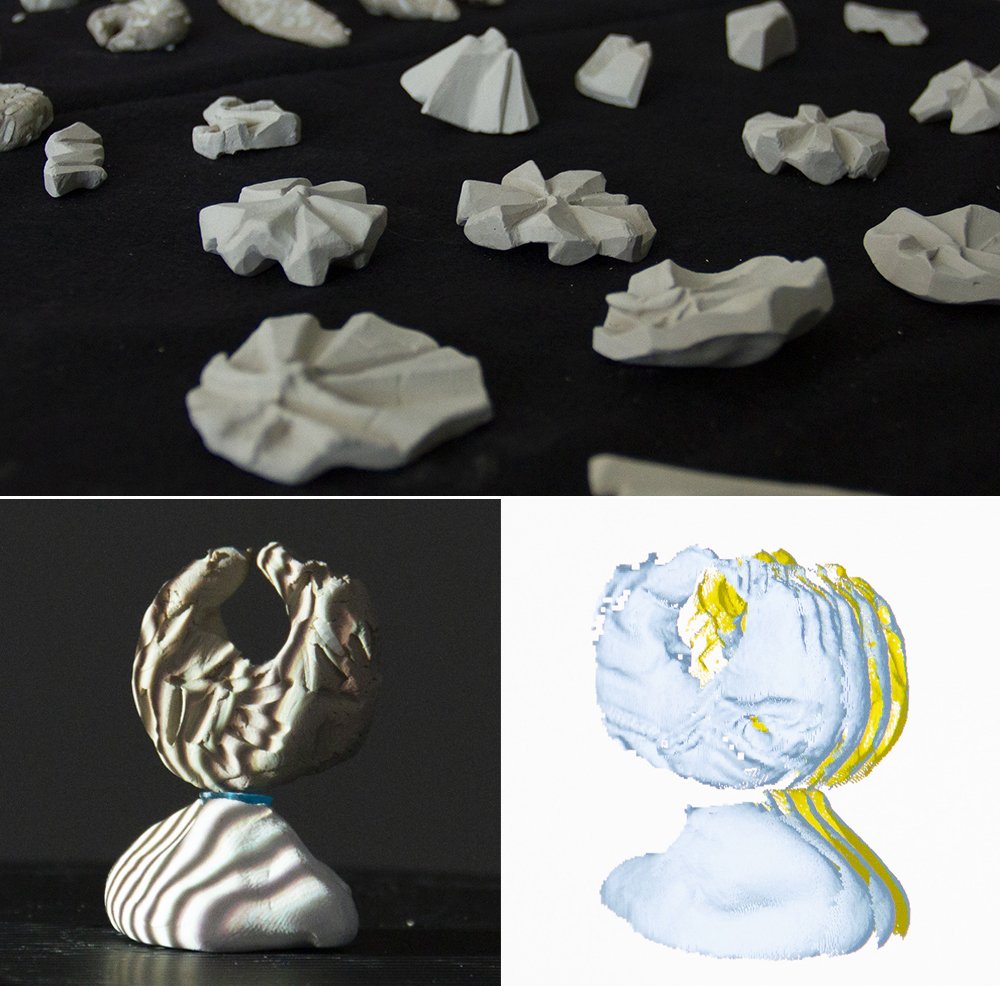
She began making these complex shapes in clay using the natural world as inspiration. She incorporated the patterns, shapes, and textures that appear in nature, noting the similarities that occur within different types and sizes of organisms. These handmade glyphs were then scanned in 3D, and gathered into a library from which visualization experts could pull for their simulations. Thus, Samsel found a way to add more instruments to the symphony.
“By using more organic shapes,” Abram says, “we can produce images that are more accessible to the way humans see the world around them.”
The symbiosis of art and science is more than just color theory, shape, and composition, however. The practical application of Samsel’s work is the creation of new tools, as well as the two-way communication between groups of people with disparate expertise. In such a way, Artifact-Based Rendering (ABR), a project she’s developing at TACC in partnership with Dan Keefe’s Interactive Visualization Lab at the University of Minnesota, was born.
ABR is a framework of algorithms, processes, and tools, such as the glyph library, created to produce more expressive and engaging 3D visualizations. The goal is to expand the visual vocabulary used in scientific visualization to provide final products that can keep up with increasingly complex, multivariate datasets.
“What makes our data visualization tools so special is that the visuals are designed with artists and draw inspiration from nature,” Keefe says. “All of the colors, forms, textures, and metaphors you see in the data visualization were created with objects found in nature or painted or sculpted by hand.”
Keefe believes this natural visual aesthetic makes the resulting visualizations more relatable, and less like they were generated by a computer. Bringing an artist like Samsel onto the multidisciplinary team only serves to make it stronger.
“It’s a cyclical loop of influence with a shared goal of creating denser, more impactful scientific visualization, which will in turn advance further research in the particular field of science,” Samsel says.
“We're bringing artists, computer scientists, and climate/medical scientists together to form a renaissance team,” Keefe says. “The goal is not just to help answer today's most pressing scientific questions, but also to learn how we can make the way we communicate visually with computers more effective.”
Going one step further, ABR brings these complex symphonies of color and shape into virtual reality. A scientist can don a headset, and move around through the visualized data, absorbing the content in a natural 3D way.
“Francesca has collaborated with TACC for nearly a decade on a wide range of projects from the visualization of flu pandemics to black hole collisions, bringing her deep knowledge of art theory to improve visualizations for insight and impact,” said Paul Navrátil, director of Visualization at TACC.
“Her specialized viewpoint that leverages the communicative and evocative capacity of art has helped the Visualization team create more effective visualizations with our collaborators. Now, she is driving important research questions into how to qualify and quantify accepted art practices when applied to scientific domains. Her unique perspective and process broaden and strengthen our team.”
Back in Samsel’s office, the Gulf of Mexico visualization continues to loop. At first glance, a viewer might perceive a somewhat abstract-looking piece of art. Closer inspection reveals the lines, colors, shapes, and patterns making up the larger image.
Suddenly, the image comes alive. The three legs of the tripod of scientific visualization — scientist, computer scientist, and artist — are now in full harmony, forming a well-practiced symphony with a conductor at the helm.
Theory In Action
TACC experts have developed visualization techniques for Department of Energy scientists who are using ocean modeling to identify areas where conditions are conducive to the growth of macro-algae for use in biofuels. Researchers need to see the spatial relationship of multiple variables in one visualization, so the TACC team developed a method to sample volumetric data and use glyphs to represent the interaction of many variables in space.
Together with colleagues at the University of Minnesota, the TACC team is exploring the use of virtual reality to present visualizations of live simulations, linking supercomputing-level tools with high-performance gaming technology.
The Sculpting Vis Collaborative is co-led by Daniel Keefe, PhD at the Interactive Visualization Lab, UMN-Twin Cities and Francesca Samsel, MFA at the Texas Advanced Computer Center, UT-Austin and supported in part by the NSF (IIS-17044604 & IIS 1704904).